Networks
Re-envisioning EPAM’s internal expertise platform around a more connected and engaging employee experience.
EPAM Digital Platform
2025 · 2 months
Envisioning · Concepting · Design storytelling

Context
Networks was EPAM’s internal platform for connecting experts, sharing knowledge, and building teams. After three years, it struggled with low adoption and a fragmented user experience. Our team was tasked with re-envisioning the platform around a clearer, more engaging experience.
My Contribution
Working alongside the lead designer and another contributing designer, I translated product ideas into interface concepts across three areas:
Discovery and navigation: AI-powered Search Graph, Networks Browser, Networks Map.
Knowledge extraction: MS Teams agent bot, Knowledge extraction survey within the Client Engagement page.
Personalized engagement: Expert Profile, Practitioner’s Dashboard, Network Enabler’s Dashboard.
I also helped shape the concept presentation for EPAM’s CEO, bringing the proposed experiences together into a clear design narrative.

Outcome
The concept was presented to EPAM’s CEO, Arkadiy Dobkin, and received support for further development. It established a shared direction for previously scattered features, reframing Networks from a passive knowledge database into an experience centered on expertise, collaboration, and recognition.
Documents
Redesigning a complex employee document platform around user needs and scalable workflows.
EPAM Digital Platform
2022-2023
Discovery · UX design · Information architecture

Context
Documents was an internal system for collecting and managing employee information and documents, used by HR, Global Mobility specialists, accountants, and personnel officers. Originally built for a small number of processes, it had expanded into a complex system that was difficult to use. We needed to simplify the experience while preserving the workflows people relied on.
My Contribution
As the key designer, I drove the redesign and guided a junior designer, with advisory support from a platform lead designer. I worked closely with Product Owners, Business Analysts, developers, and QA throughout the process.
We started by defining three personas based on system roles and interviewing representatives of each group. Mapping a key user journey helped us identify pain points and translate the findings into user needs.
Together with Product Owners, we aligned those needs with product OKRs and identified improvements to the system. We then organized the proposed features into an information architecture, refined it with stakeholders, and developed interface concepts. These were tested with users before being handed over to development.

Outcome
The redesign brought user needs and stakeholder priorities together in a clearer system structure. This laid the groundwork for adding new processes while keeping workflows consistent and easier to navigate.
People Central
Rethinking an internal people management tool around the needs of its core users.
EPAM Digital Platform
2022 · 4 months
Discovery · Research · UX design · Concept testing

Context
EPAM needed a tool to support people management as the company planned to grow its workforce. When I joined, initial user research and a low-fidelity concept were already in place. Our team was asked to revisit the findings, reconsider the project’s focus, and develop a new concept.
My Contribution
As part of a four-designer team, I contributed to research, journey mapping, concept design, and testing, working closely with the Product Owner and Business Analyst.
We reviewed the existing interviews and segmented the audience to identify the core user group. Additional interviews with this group helped us clarify their needs and pain points, which we brought together in a customer journey map.
These findings informed a new concept that we developed and prototyped together. We aligned it with stakeholders and tested it with users using the RITE methodology, refining the design as issues emerged.

Outcome
The new concept was presented to stakeholders and senior management and approved for implementation. Budget was allocated to move the project forward.
Tengizchevroil Intranet
Redesigning an employee portal to make information easier to find and streamline news publishing.
Tengizchevroil
2021-2022
Research · UX/UI design · Usability testing

Context
Tengizchevroil (TCO) is a Chevron joint venture operating in Kazakhstan’s oil and gas industry. Their employee portal had been in use since the 1990s. Its outdated structure made information difficult to find, while news publishing relied on a manual process with different approval workflows across departments. The redesign needed to improve access to existing resources and simplify publishing without losing what employees already valued.
My Contribution
As the sole designer, I was responsible for research, UX/UI design, prototyping, and design delivery. I worked directly with the client, presented design proposals, and contributed to the TCO design system.
For the homepage, I conducted a survey that collected more than 600 responses to identify the information and features employees valued most. Together with research into intranet best practices, these findings helped me prioritize content and restructure the homepage.
For news publishing, I interviewed the people involved and mapped their journey to understand the process, pain points, and approval requirements. I then designed a workflow to automate routine publishing tasks while accommodating differences between departments, and tested the concept with users.

Outcome
The MVP launched and received positive feedback from users and client stakeholders, including TCO’s General Director Eimear Bonner. It brought together a redesigned employee portal and a new workflow for creating, approving, and publishing news.

My Activ | My Kcell
Evolving a subscriber self-service tool across two brands and platforms through ongoing product design
Kcell JSC
2018-2020
Product design · Information architecture · Design system

Context
Kcell JSC is a large mobile operator in Kazakhstan with two brands serving different audience segments: premium Kcell and affordable, mass-market Activ. The company’s main digital product was a subscriber self-service platform available through mobile apps and web.
My work focused on continuously improving the experience across mobile and web, balancing shared functionality with each brand’s distinct identity.
My Contribution
As the sole product designer, I worked closely with the Scrum team, Product Owner, and UX researchers to improve the experience and develop new features over successive releases.
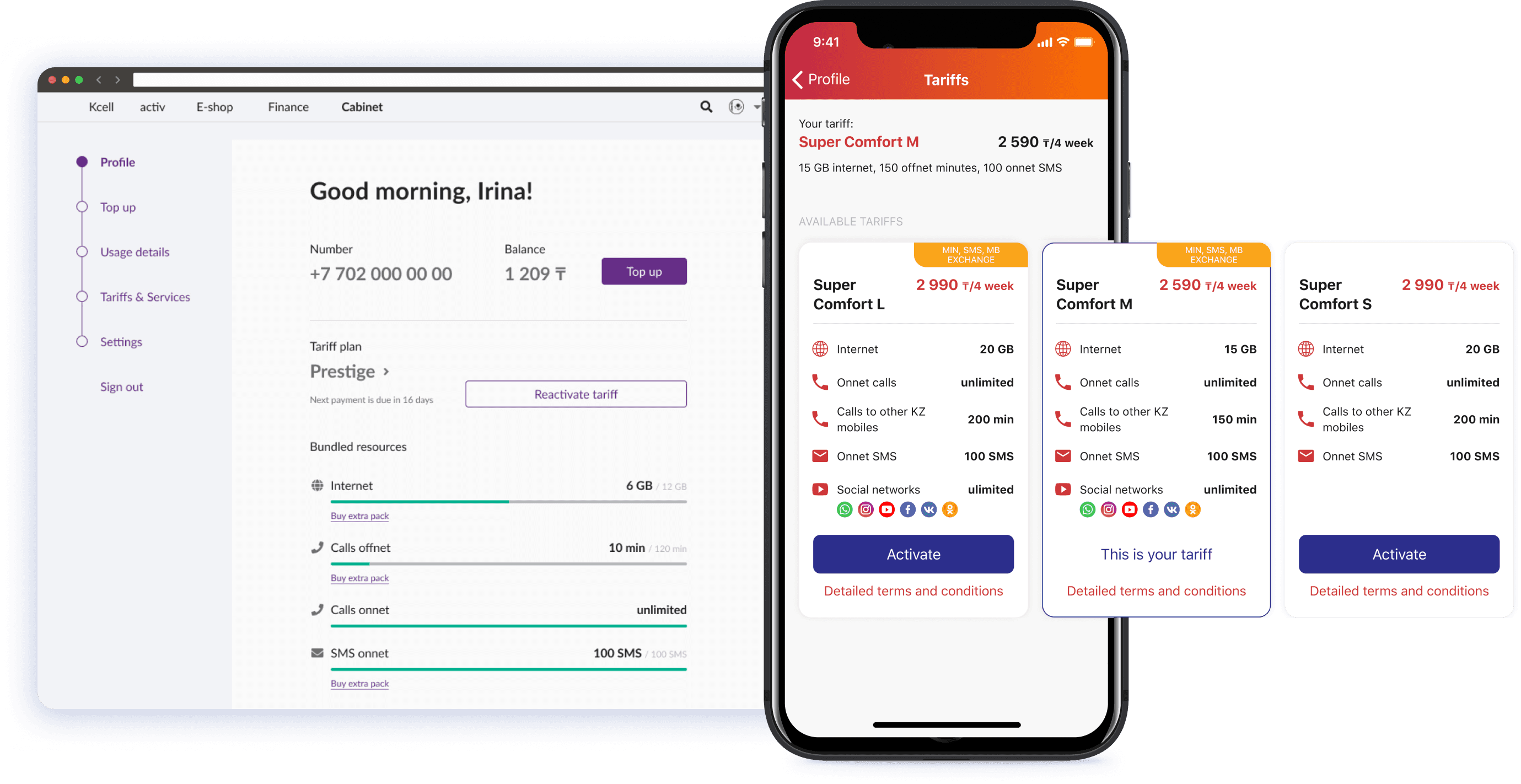
Research findings informed changes to the information architecture and a redesigned dashboard that brought key account information together. I adapted core experiences for web and created a shared design system with separate brand themes, accommodating Activ’s and Kcell’s different fonts and colors across iOS, Android, and web.
Alongside this foundational work, I redesigned plan selection and designed the in-app eSIM issuance experience, supporting the product’s evolution from everyday account management to new self-service capabilities.

Outcome
During this period, we relaunched both mobile apps and web platforms with a shared design system and continued to expand their self-service capabilities. The redesigned plan selection page doubled the number of plan changes, while the launch of in-app eSIM issuance made us the first mobile operator in Kazakhstan to offer this capability.
SIM Terminal
Designing a touchscreen self-service experience for buying SIM cards in public spaces.
Kcell JSC
2019
UX/UI design · Interaction design

Context
The SIM terminals were designed for airports and other public spaces, serving both local residents and people arriving in Kazakhstan. They offered SIM and eSIM purchases, balance top-ups, and replacement of lost SIM cards.
Unlike mobile and web, the terminal’s large portrait touchscreen required a different approach to layout and interaction. The experience needed to be easy to read and navigate while standing in front of the device.
My Contribution
I designed the interface around the terminal’s screen format, using larger controls, buttons, and typography to support touch interaction. The fixed screen dimensions also allowed me to explore transitions and animations tailored to the device.
Throughout the design process, I checked the layouts on a 24-inch monitor in portrait orientation to assess their scale and readability beyond the design canvas.
Outcome
The resulting design brought SIM and eSIM purchases, replacements, and top-ups into a single touchscreen interface, with layouts and controls adapted to its larger format. Checking the screens at physical scale helped me refine the design for use on the device rather than simply enlarging a mobile interface.
Kcell eStore
Designing an online store for smartphones and accessories, with a clear way to compare device contracts.
Kcell JSC
2019
UX/UI design · Responsive design

Context
The Kcell eStore sold smartphones and accessories to subscribers of both Kcell and Activ. Customers could buy a device at a fixed price or choose a contract: they paid in monthly installments and got a bundle of mobile services for the length of the contract.
The contract was often the better deal, but its real cost was hard to judge at a glance, so many customers could overlook it.
My Contribution
I designed the store from scratch. To make contracts easier to understand, I proposed its key feature, which set it apart from typical e-commerce: a contract calculator on the product page. Customers pick the contract term, service bundle, and upfront payment, and immediately see their monthly and total payments. Recommended contracts next to it gave quick starting points. Our analytics showed that most store traffic came from mobile, so I designed mobile-first.
Outcome
The calculator made the contract option clear: customers could compare payment plans and see the full cost before committing, instead of working it out themselves.
MobiMoney
Designing a fintech app for paying for goods and services with mobile phone balance.
Kcell JSC
2018
UX/UI design · Mobile app design
Context
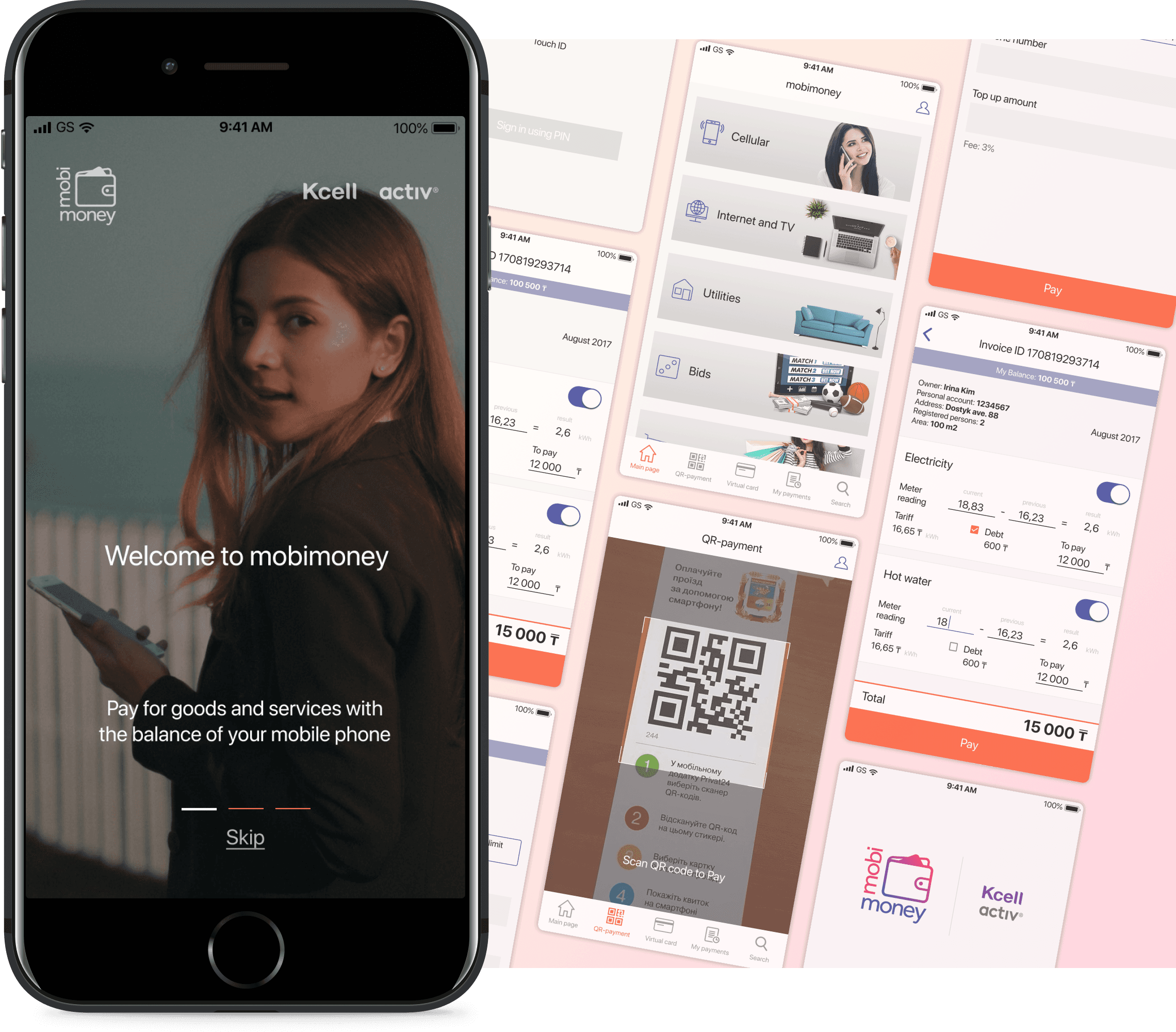
MobiMoney was a Kcell fintech app that let subscribers pay for goods and services with their mobile balance. Users logged in with a one-time SMS code and could then pay utility bills, internet and TV, or scan a QR code to pay in stores.
The idea was simple, but payments often involve dense financial information, especially utility bills with meter readings, rates, and debts.
My Contribution
After interviewing the product owner, I decided to build on familiar patterns from popular fintech apps, so the experience would feel natural from the first use.
I kept the visual design clean and restrained, so detailed financial information stayed readable without overwhelming users.
Outcome
The final design turned mobile balance into an easy way to pay, using familiar payment flows and a clear layout for complex bills.
Back